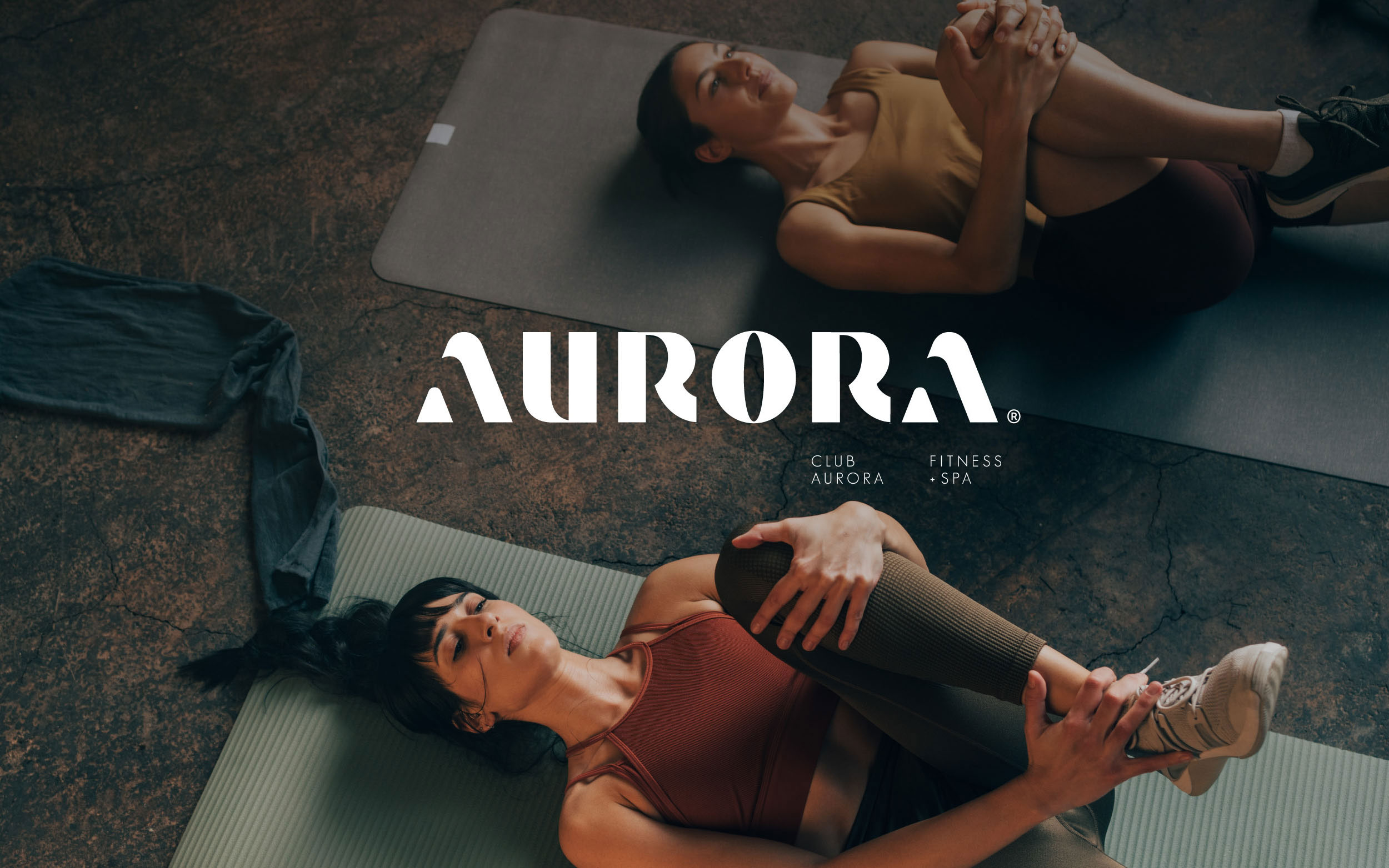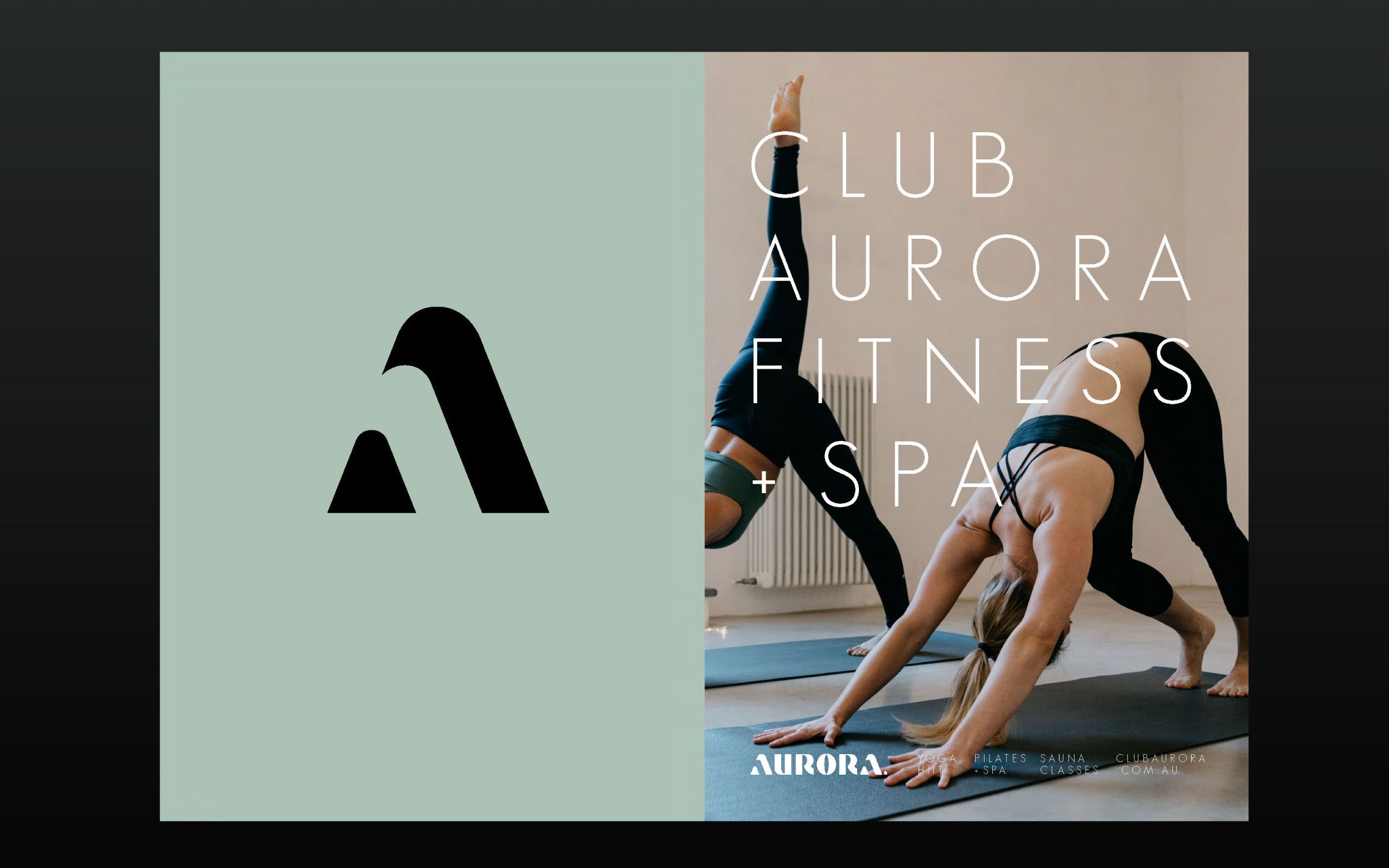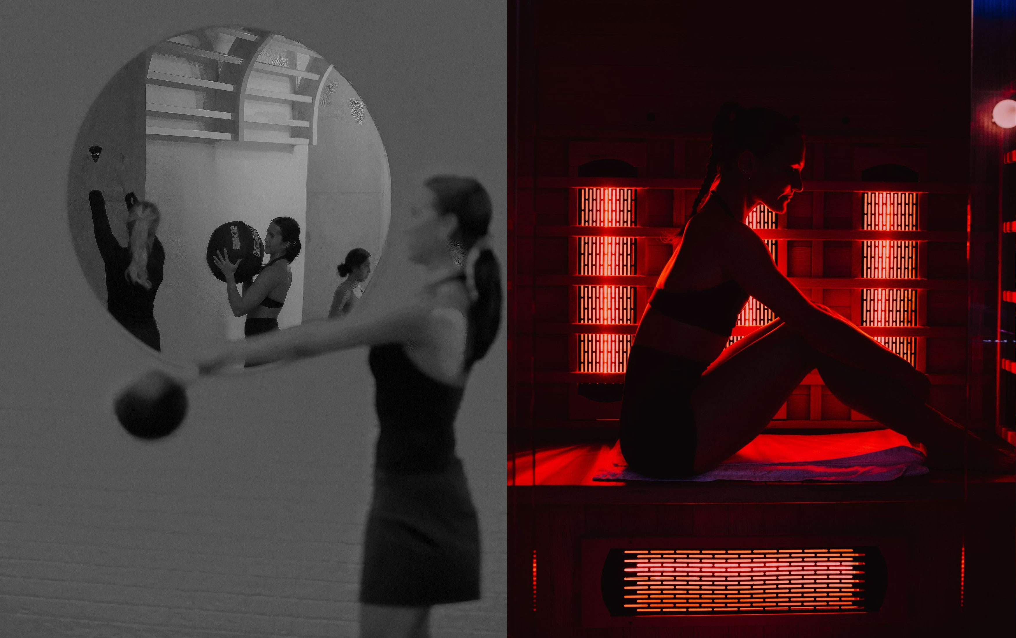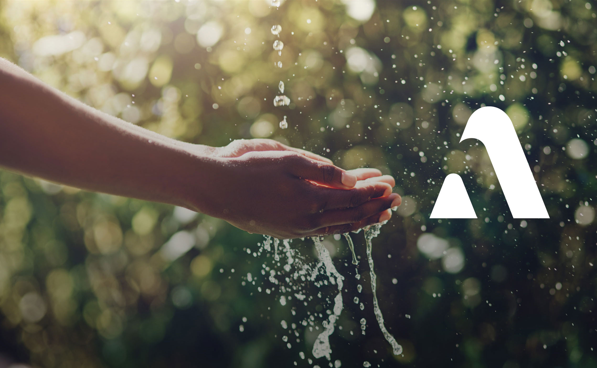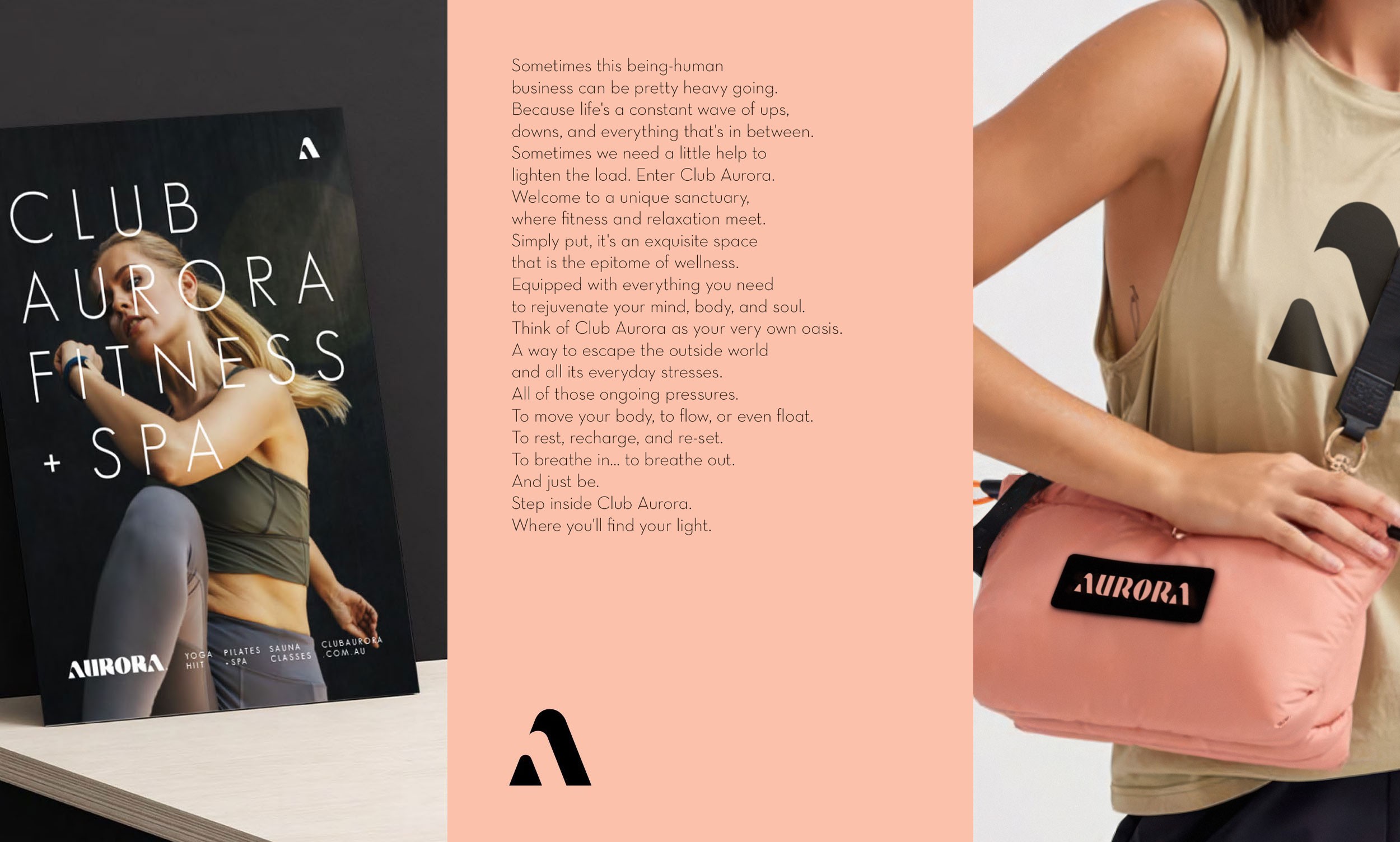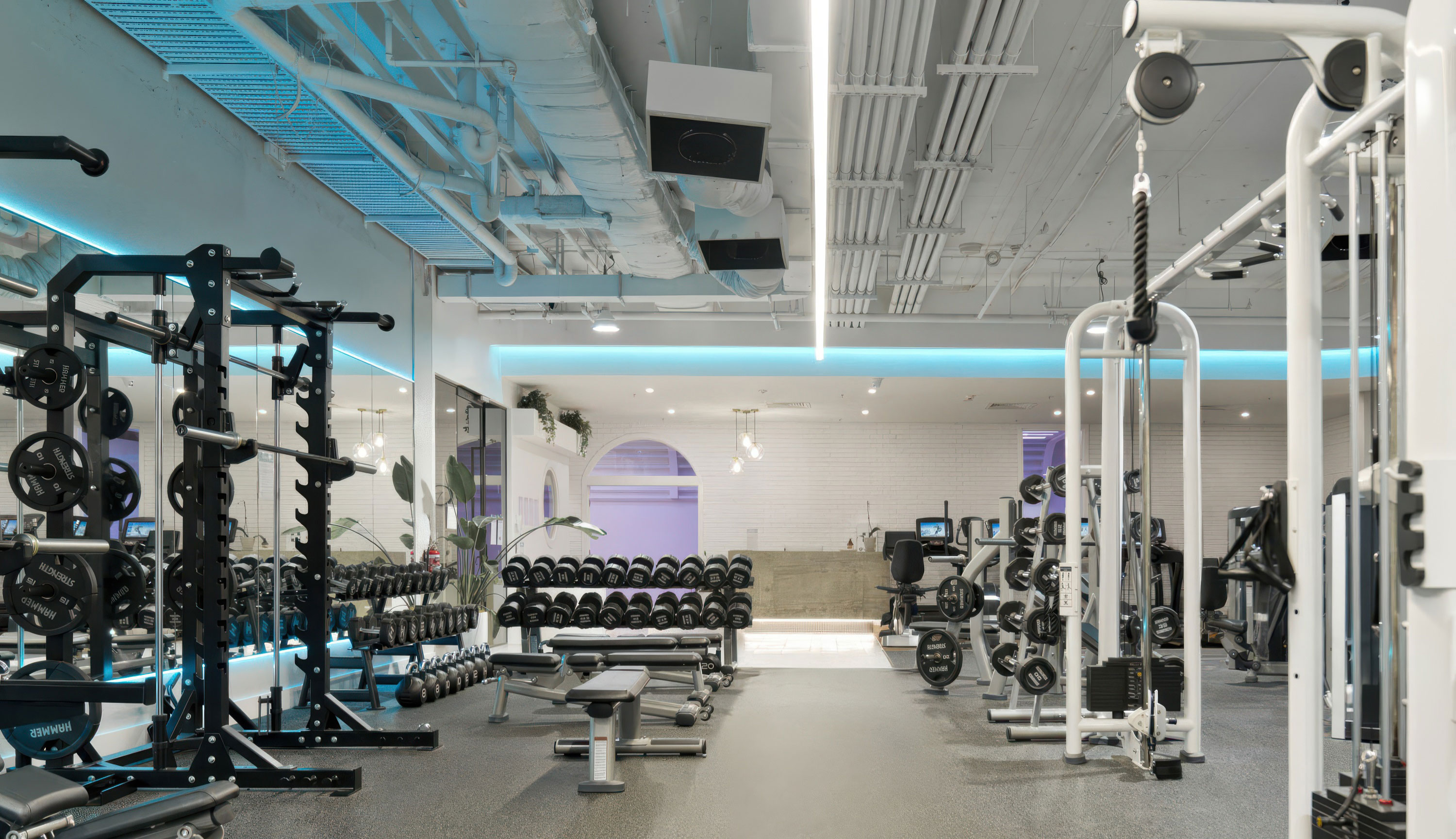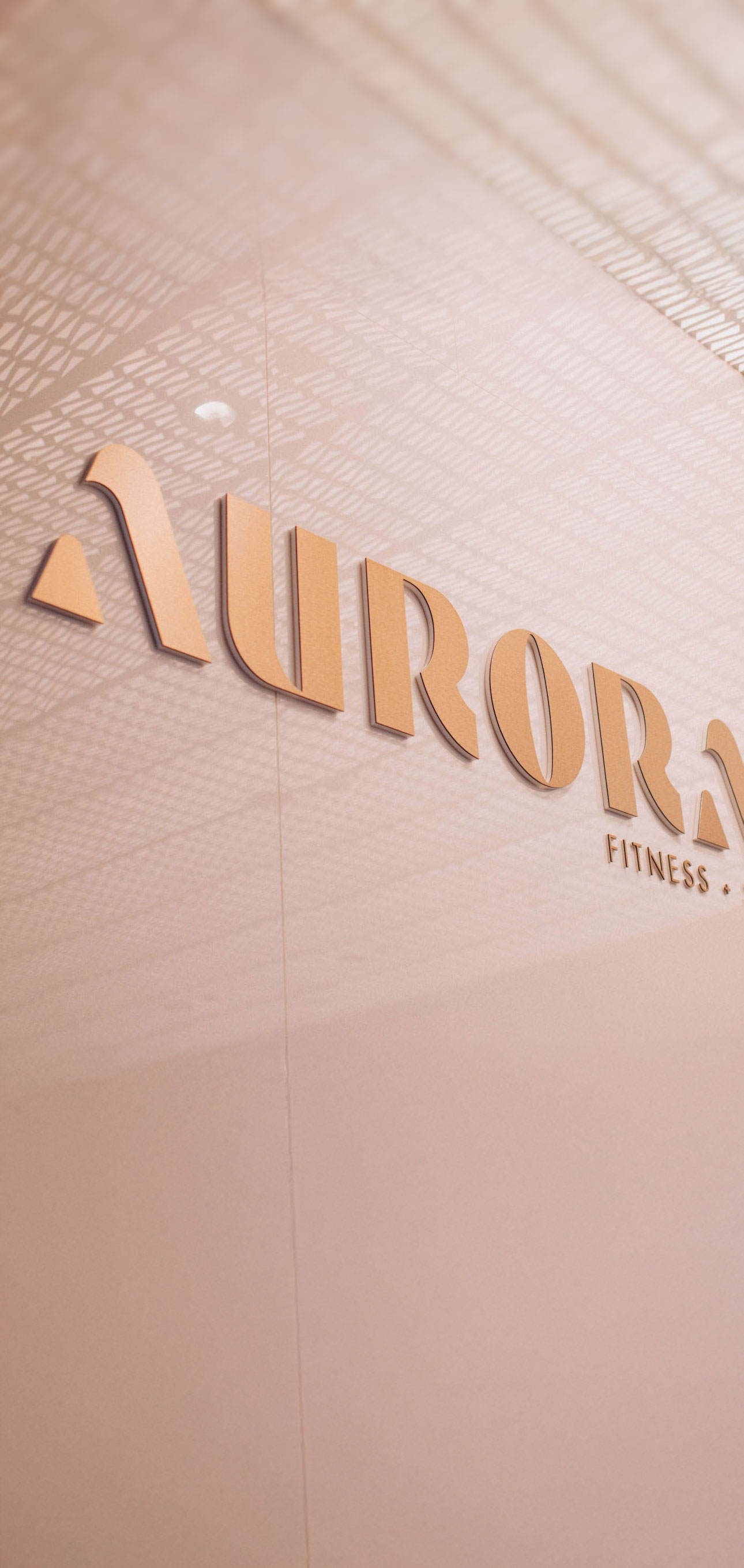
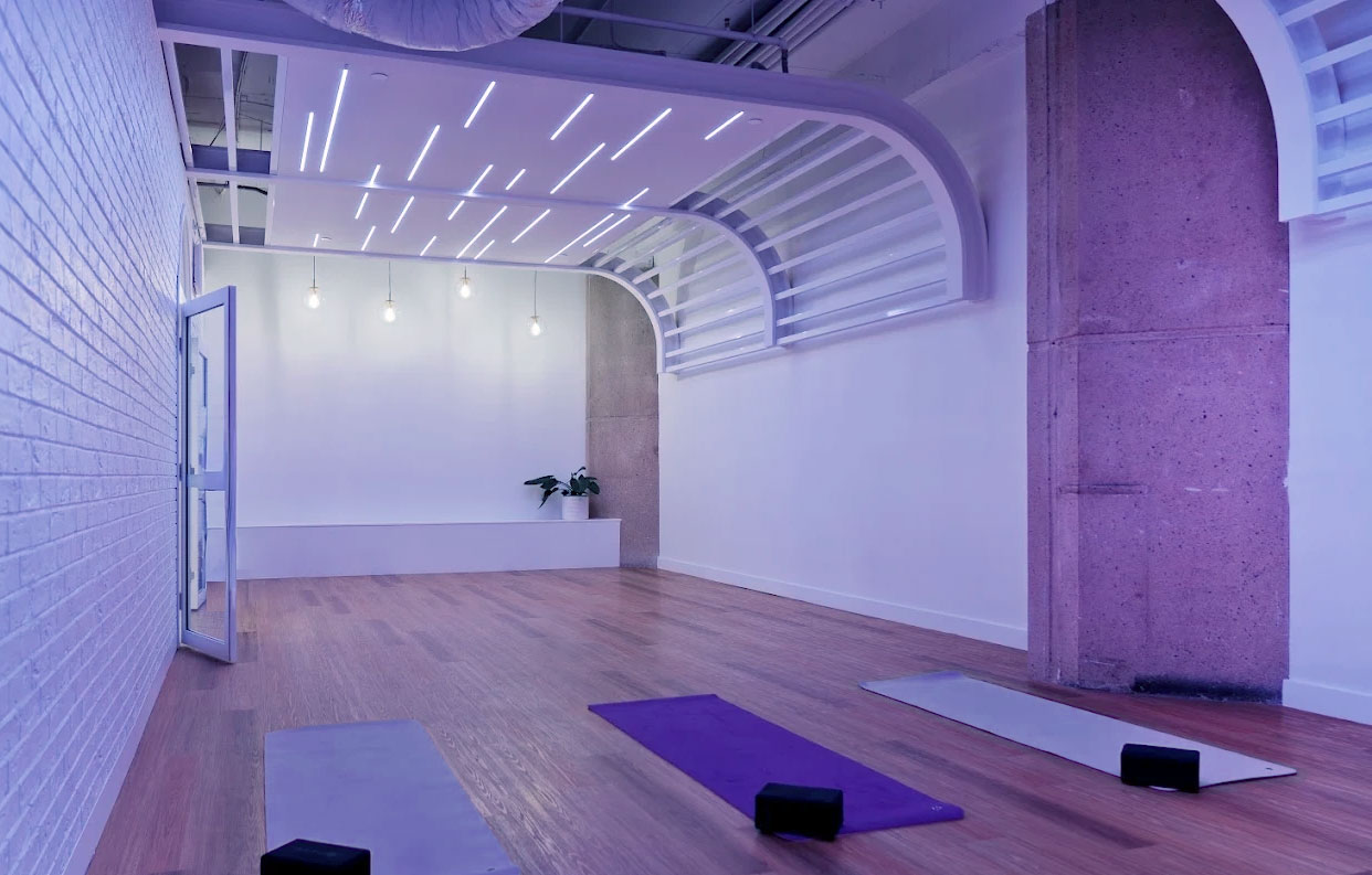
Club Aurora is envisioned as a sanctuary within the crowded fitness landscape, where wellness becomes both the purpose and the experience. Centred around its spa, sauna, and float facilities, the club offers restoration alongside movement, balancing strength with stillness. Departing from the loud, masculine language of traditional gyms, the identity embraces a refined femininity inspired by luxury retreats and moments of quiet escape. A bespoke logotype anchors the brand, with a stylised icon that subtly echoes fitness equipment and the curve of a running track, while symbolising harmony between mind, body, and soul. Soft natural tones and aspirational imagery weave together exercise and relaxation, creating a sophisticated visual world that avoids cliché in favour of originality, elegance, and elevated wellbeing.
Client
Aurora Fitness +Spa
Location
Brisbane, Australia
Scope
Brand Strategy
Visual Identity
Art Direction
Brand Imagery
Print & Digital Media
Website
Display Suite
Site Signage

STRENGTH IN STILLNESS.